Thursday, December 9, 2010

Unit 2:Point:Explorations

Vanna Venturi House

Louvre Pyramid
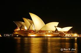
Sydney Opera House
The Explorations Unit really brought the whole year together. Modernism in my opinion is the simplification of all former style periods. It is also the magnification of some of the elements introduced within those periods.
For example, the Louvre Pyramids is a modern reflection in conjunction with the ancient pyramids of the Egyptians. It is not only like it with it’s outward appearance, but with it’s inner affects as well. The Egyptians buried their pharaohs inside along with their most prized possessions. After death, the pharaohs were thought to move into a new life and be one with the gods. For this day and age, the Louvre Pyramids hold the same concept. Inside are shops which hold possessions. These possessions help the consumer transform themselves into something they feel to be more superior.
The Sydney Opera House is another modern structure derived from historical concepts. The shape is based on what appears to be the wings of a bird or a symbolic representation of an egg.,Therefore, bringing in the classical elements that nature is the root of all design. Also, the wing-like structure is also a manipulation of the Roman arch.
In an artifactual sense, Le Corbusier’s ribbon windows can be depicted as a developed clerestory window. They are strung together with mullions in between to manipulate the amount of light as well and the direction.
However, as the designs have been simplified, many feel that they have lost their validity. More so, they seem to be so minimalistic that they have become disposable. Expanding on that you can relate design to the classics such as the Hypostyle Hall, House of Vetti, Parthenon, Pantheon and so on. After hundreds of years, they are still standing and are still praised. Designs today are built so that if they aren’t successful they can be deconstructed and rebuilt into something more pleasing to the consumer. This poses a huge issue for designers today and in the future. Should we revert back to the highly embellished classics, or is it even worth it to put so much effort into something if it can be so easily destroyed?

Wednesday, December 8, 2010

Friday, December 3, 2010

Reading Comprehension 7 for IAR222

Within the theme of the exhibit assigned to your group, select ONE work and draw a diagram of the
work, using the principles and elements of design. Write a 250-word annotation for your diagram to the
themes of the EXPLORATIONS unit and the readings assigned for this unit. In your annotation, analyze
and include at least one other work of art in the theme you have been assigned, make 3-5 appropriate
citations from the readings, and consider SCALE (artifact, space, building, and place) as you complete
your work.

creature world: arabian
(image placed here)

The image above is a diagram of Jim Hodge’s “Good Morning” of 1994. It is made of silk with a silver chair where the spider web is.  In looking at the real artwork the viewer can see that above the web, the silk is tattered and torn, this symbolizes the trials of such a movement when putting two unlike things together. Such a trial is seen in modern architecture when a new structure s placed near an older structure from a different time. The new manipulation of the space can be successful or not just like an artwork.
The rose petals printed on the silk represents the elegance of what could be forbidden. There is a sense of balance with the sparkle in the chain of the web in relation to the matte finish of the silk. It is asymmetrical. More so, the light airy palette makes for a whimsical experience when looking at it. Massey said “Taste in woman may be said to be natural to her sex. She is the mistress of the house in which she orders like a queens”. This artwork has the ability to completely change a space with its presence.
As I was walking through the exhibit, I noticed that each painting, sculpture, digital media, whatever, was full of feeling and emotion. I also read on the panel in my group’s exhibit that “artworks also function as more than just visual images”. This quote led me to think about how a piece of art can change a space completely. For example, Richard Broderson’s “Figure with Bird and Dog” has the potential to make a whole room feel cold, gloomy, and possibly eery. On the contrary, “Adam and Eve” by Mariam Schapiro brings a sense of chaos to a space.

“As a reaction against mainstream Modernism, some interior designers, whether architecturally trained or not, have moved towards fine art and literature as their sources of inspiration.”
-Massey

Wednesday, November 17, 2010

Reading Comprehension 6 for IAR222

[1] A common theme of the early twentieth century found in Roth, Harwood, and Massey set the tone for
an understanding of styles in architecture and design influenced by fine art. Selecting either Arts +
Crafts or Art Nouveau, TRACE the influences of the selected style in more than two nations. In your
answer, you should include evidence from the readings and at least two annotated images as support
for your analysis of influences.

Paris Opera:Paris

Atelier Elvira: Munich,Germany


Art Nouveau was about creating something with an exotic feel. It was considered “art for art’s sake”.  The influences, while they may seem like completely different buildings shown above are the same for each.  In these images lies the influences of Ancient architecture, such as Greek and Egyptian, as well as Gothic influences. In the image of the Paris Opera house, you can see the formality of these eras. The Ionic colonnades, the use of stone-like materials, and the repeated ornamentation circling the room are all influences from Greek and Egyptian architecture. The statues around the room are very similar to the ones inside of the Pantheon and in the Temple of Athena. Also, note the Gothic influences with the embedded columns around the inner walls. In addition to the columns, are narrow archways that provide a greater illusion of height just as the Gothic cathedrals do.
In the picture of Atelier Elvira, a more casual influence is apparent. It is clear of the natural influence with the root-like ceiling which is used much like the ornamentation of the Papyrus columns at the Hypostyle Hall. This interior is more organic. The thick sweeping curves may come as a result of the lavish Baroque style period. Gothic however isn’t forgotten, the pointedness of the roots reflects the spiked ornamentation of it’s architecture.

Anne Massey describes Art Nouveau designers as ones who concerned themselves with all the elements of a building, from the architectural shell down to the door handles. ( Massey, p.32)


[2] Originating at the Bauhaus and in the work of LeCorbusier, the so-called Modern movement deeply
influenced design and architecture of the twentieth century. The great debate raised by this new
approach to design involved the presence of the machine in the design process and final products.
SPECULATE about the implications of “machines for living” and the famous dictum “less is more” on
design today. Use at least one ARTIFACT, SPACE, or BUILDING in your answer, providing a salient
image (cited) and annotation to help bolster your argument.


http://www.radio.cz/en/section/panorama/daniela-hammer-tugendhat-our-villa-was-stolen-and-now-has-to-be-returned


Machines changed the architectural world. They made Modern architecture affordable for almost everyone, or at least more than the previous eras of Arts and Crafts had. Mass production came about which allowed many items to be constructed in bulk. It also made building faster. Going deeper on that note, when bringing the statement “machines for living” inside, a new meaning arises. In the image above of the Tugendhat House, I think machine refers to the partitioning wall. The ability to constantly manipulate a space was a revolution in architecture. One could also say that the statement is talking about the need of machines to cut the materials used in interiors, such as iron, glass. and marble seen in the image. However, this brings up the dictum “less is more”. While these materials may look simple, with low ornamentation they are rich in themselves. The crisp and light color palette of these materials creates a beautiful interior with the help of the flood of natural light coming from the large glass-ribbon windows.
“Inspired by a new movement aesthetic, the Modern Movement stripped away unnecessary ornament from the interior.”(Massey, p. 63)
On the contrary, less is more. These materials are not cheap. It does cost more to cut things such as marble. Modernism isn’t just about the use of the machine. It is about perfection. For example the Barcelona chair in the image, isn’t machine made. It is hand crafted. One would never know that unless research was done, because of its great craftsmanship and great attention to perfection in it’s detail. Many designers such as Werkbund, challenged the industry to raise its standards while still acknowledging mass production.


[3] From the assigned pages in Roth, Harwood, and Massey, SELECT an image that you believe
explodes the notion that Modern interiors and objects were black and white. Fully RENDER your own
design exploration of that image through color, material, and light and appropriately annotate and cite
the image to prove this point.


In the image below, I chose to render it in the way Charles and Ray Eames did their home. they used bold reds, blues, and yellows. They also used iron as an agent in their design. The floor is a marbled-like cement which celebrates the modern use of materials. The club hub chairs are also a nice modern touch to this interior. 

Massey p. 114

Friday, November 12, 2010

Reflections Summary


For the Reflections Unit summary, I selected the blogs of Cassie Bradfield, Kelly Harris, and Jasmine Jones. Each described the unit as being about a revolution, and also about how the industrial revolution played a major role in changing the way architecture is viewed and made.
Cassie did an outstanding essay on the unit. She touched bases with every point that had emphasis on the 18th and early 19th centuries. The image she used to describe the unit was very original and extremely on point.

From Cassie's blog

Kelly took a more artistic approach to the unit. She compared the unit to water and also Monet’s Water Lilies. Kelly also made an interesting point in her essay, she mentioned that Versailles was and had a design at every scale. I have never thought of that before. I began looking around my apartment after I read that and realized that it is true for all interiors maybe not as lavish and vast but still existent.
Jasmine mentioned a very unique idea in her post. She stated that during this time period, people were scrambling for an i.d. I find that to be very intriguing and true. Her image was also extremely relevant on her post as well.

From Jasmine's blog

 http://cassandrashannon.blogspot.com/
http://kelysiarcblog.blogspot.com/
http://jasminenicolej7.blogspot.com/

Alternatives Summary

In reviewing my classmates Point summaries on the Alternatives unit, I chose to focus primarily on the blogs of Austin Loman, Abigail Buchanan and Leslie Canipe. All three did a great job in explaining the unit very well. I could tell that they understood the unit in great detail. Even if I wasn’t in the class I would be able to comprehend the Gothic, Renaissance, and Baroque time period.
Abigail’s blog post gave a great overview of each unit with great examples of each time period. She emphasized the importance of the reviewing of the classic elements in each of the time periods.
Leslie’s post consisted of an in-depth analysis of the Gothic era. She pointed things out that I had never thought about. For instance, “The main concept is “Ecstasy and Exultation,” which essentially relates to the shaping of space around the light, colors, and amplifiers themselves.”  After reading her excerpt,  I gained more knowledge about the Gothic era in particular. She also pointed out that in the Renaissance, our main principles of design and design elements came into play.
In Austin’s review of the Alternatives Unit, he stated that the Renaissance was a cultural revolution. I had never thought about the Renaissance being a cultural revolution before. His statement allowed me to think about the Renaissance in a more thorough way than just the analytical way I had been. Austin’s image of David also became more clear to me. I finally understood the emphasis that Roth, Harwood, and Patrick were putting on this image. 

Bernini's David

Monday, November 8, 2010

Point Reflections

At the start of American colonialism during the 19th century, there wasn’t much the American’s could contribute back to the world in terms of goods and products. A few raw materials is all the American’s had. However, after the Declaration of Independence in 1776, American’s were free to barter and trade with whomever they pleased. Being that America was centered in the middle of the two major trade oceans, the Atlantic and Pacific, goods were received from the East and West.
Goods from the East brewed a new change in design for the Americans. A completely new style of architecture and textiles was introduced. The eastern countries brought many things with them such as textile patternings, vibrant wallpapers, unique Indian domes, red sandstone, etc. One of the most predominant things contracted from the East was the fabric, silk. Silk is a very delicate fabric that was also durable, and deemed classy. The use of silk had many advantages. Women’s clothing was of higher quality as well as a lighter weight burden on themselves. The textile patternings along with the use of silk allotted for a vast amount of fabrics that were extremely luxurious. They could be used as drapery, bedding, for furniture. Anything could be done with silk for the most part.
Whatever is sterling must also have it’s downfall. Silk is only produced once or twice a year from the silkworm. Therefore, the demand becomes to high for the outcome, resulting in an increased price. Intern making it eventually only available to the wealthy people of this time.
Another huge achievement during the 19th century was the rise of the machine. During the Industrial Revolution, the production of iron and glass came about that changed architecture forever. Constructing a building became faster and the buildings became stronger. Also, buildings were able to stretch far more further than before. The span of a building reached approximately three-hundred feet. This is the age in which sky scrappers were constructed. Not only was the business world improved with architecture but also leisure was advanced. Many new arcades such as the Crystal Palace came about. In addition, a vast amount of operas and train stations arrived.
The need for shopping arcades as well as new textiles peeked just as women’s rights began to change. The more freedom women were given is a direct correlation to the architecture of the 19th century. For instance during the time of the Arts & Crafts era, even though it was predominantly male, the presence of a woman is apparent. The interiors mainly are more aesthetically pleasing with softness all around. Architecture seemed to free itself temporarily from the constraints of the classical world and branch out to revive other styles such as the Gothic. It wasn’t until Henry Hobson Richardson constructed the Trinity Church in Boston, that true american architecture was seen. Until then America was a huge melting pot full of various architectural styles. The image below is of the Trinity Church in Boston.  You can see the various style periods all throughout, dating back into the Egyptians and Greek days.
http://www.bluffton.edu/~sullivanm/bostonrich/bostonrich.html 

Wednesday, November 3, 2010

Reading Comprehension 5 for IAR222

[1] From the Roth, Harwood, and Massey readings, select an ARTIFACT you believe to represent
revolution in design. SPECULATE about the type of revolution this artifact symbolizes. Supplement
your answer with a beautifully hand rendered image of the artifact you selected, citing source and page
on your image.
Harwood(II) p. 28
This revolution in design strives from the gain of womens' rights in the 19th century. The free flowing of this chair is like the swaying walk of a woman. The back legs coming off of the chair symbolize a woman's dress. More so, the but of the seat is curved, showing the passion women show rather it be in the comfort of a chair or in everyday life. Also, the materials used in this chair are a direct relation to the Industrial Revolution in the 19th century. It is comprised of iron.


[2] Using the internet, LOCATE and ANALYZE an image for an ARTIFACT, a SPACE, a BUILDING, and a
PLACE, drawing the idea of eastern influences as understood by nineteenth-century minds (China,
Japan, India, Middle Eastern) on western design and architecture. Each answer must include an
appropriately annotated and cited image in addition to a well-crafted essay to defend your choice of
each image and the ways (more than one) that the material item responds to design influences from the
east.


In the 18th century, Eastern influences were introduced to the remainder of the world. The influences in the mirror appear quite boldly with the vibrant gold coloring and drapery. Golds and reds are used in many Asian articles as well as royal blues. The drapery imitates the style in which Chinese curtains are gathered. The mirror is also texturized to symbolize silk. Silk is a natural fiber that is very smooth, often sheer, and generally considered luxurious. 
The chair on the right is a simple chair with a decorative back. The back is lucidly lined and depicts a dragon which is a very common decorative motif in Asian cultures too. Looking more into the back of the chair it seems as though it comprised of lines that form tiger-like paws at the top of what would be considered the dragon’s tail. Tigers are also another well-known Asian motif. 


In the space provided above, the coloring is a great representation of Eastern works. A more prominent Asian detail is the Bamboo plant holder in the right of the image. Bamboo is generally associated with the Japanese and Chinese culture because it grows so rapidly and vast in their soils. It is furthermore considered as a symbolic article of luck and good fortune. Also, the textile patterning is a runoff of traditional Indian patterning. The pattering in the wallpaper is the same markings used in in the ritual of hand art in the Hindu religion. The use of materials, such as the rich woods and the strong fabrics, is another aspect of the Eastern culture. Even though the Industrial Revolution came about in the 19th century, in most instances the Eastern countries strayed away from the use steel and glass for personal spaces and furnitures. The use of natural materials connects one with nature while also providing a sense of warmth in the cold hustle-and-bustle society.


The Texas State Capitol is not only a building but a place, as well after its underground extension in 1993.  From the exterior it is somewhat apparent of the Eastern influence with the steepled dome and red granite walls. The light use of patterning on the gate also strives from the East. But it is more evident on the interior of the building. You can see in the image on the right, when looking down inside the dome, the image inscribed on the floor was inspired it seems by Indian patterning. The image may also reflect the Chinese patterning found in minor artifacts like teapots and other ceramics. Also, in the interiors the gold and red are shown again.

Sources:

Artifact:

http://www.christies.com/features/auctions/0909/7750/

http://www.framemuseums.org/jsp/fiche_oeuvre.jsp?STNAV=&RUBNAV=&CODE=O11504617312681&LANGUE=1&RH=UsaFRAMEMuseums&OBJET_PROVENANCE=COLLECTION


Space:

http://www.library.illinois.edu/spx/BigRead/StoletovHouse2.jpg


Building:

http://zippothepirate.blogspot.com/2005_01_01_archive.html

http://webitect.net/general/40-delightful-pieces-of-tilt-shift-photography/

Monday, October 25, 2010

Point: Alternatives

The Sistine Chapel- Renaissance

Amalienburg- Baroque


The definition of an alternative is something existing or functioning outside the cultural norm, and being different from the usual. This is the perfect explanation of what occurred during the Baroque and Renaissance eras. When designers decided to step out of the “comfort zone”, revolutions were created that changed all that was known. People were now able to express their personal style.
After the Gothic era, when the Renaissance emerged, all classical language was reborn. The aspects of direct proportion of the colonnades on the exterior with complete building height was revamped as well as symmetry, the arch and classical ornamentation. Roundels become more apparent in buildings. The triangle above entrance-ways also reappears.
Everything in the room was designed again for a purpose. Furniture, textiles, and other ornamentation streamed from one another. They seem to all be designed to fit together and coexist so that a balance of color and texture is achieved.
However many of the “standards” of architecture were challenged and broken too. The manipulation of perspective was created. It is apparent in paintings but more importantly it is important in the interiors of buildings. For instance, the ceiling in the Sistine Chapel is a flat roof, but Michelangelo modified the ceiling to appear as it was a vaulted ceiling.
Streaming from Michelangelo’s movement with perspective, in the Baroque era, walls and ceilings seem as if they melt together. The manipulation of the walls along with the use of light and mirrors created a design that was known to most as “over-the-top”.  An extreme use of high ornamentation and filagree created a chaotic atmosphere that was sometimes overwhelming. Contrarily though, the Baroque era had far less furniture in terms of mobile furniture, i.e chairs and tables.
Like all extreme things, the Baroque era eventually fizzled out, while the Renaissance kept moving and is still thought by many to exist today. Classic ornamentation never goes away. It is the standards that hold all together. Most eras are fads. The reason all eras besides the ones that derive solely from the Egyptians and Greeks fail is because they try to hard to break the rules. Just like anything, straying away from the norms of everyday is something most can't adapt to, not only in architecture but in anything. It may be fun for a while, but eventually everything always reverts back to the original principles.

Monday, October 18, 2010

Reading Comprehension 4 for IAR222

[1] Just as we learned with Gothic cathedrals, in the context of each PLACE, the other scales of analysis
(ARTIFACT, SPACE, and BUILDING) each demonstrate difference. For each scale on the readings rubric
above, EXPLAIN at least one common design language that links them all. Use the principles and
elements of design as defined for this class in your response. Explicitly tie the Roth reading to your
analysis, using at least one cited quote.

In talking about the scale of artifact in terms of a common design language that they each possess, one could state that each of the five listed are simple shaped objects with a high amount of decoration. While the decoration amount varies for each object, it is suitable for the context and size of the object. For example, the Windsor chair is small and doesn’t have near as much embellishment as the state bed at Osterly Park or the desk/bookcase with chinoiserie had.  Each possess classical dress and are made primarily of wood.

When comparing different interiors at the scale level in the matrix provided, each of the rooms were unique in their own way but all share a few commonalities. The first is that the rooms’ ceilings were made to appear different than when they were built. Some such as the Holkham Hall Saloon have ceilings in which they seem to be dissolving into the walls. Also they seem to be higher and are constructed with an oculus or clerestory windows. Even the ceiling in the Parlor of the Gardner-Pingree House, which is just a flat white, gives the guest a sense of clarity and brings about a certain airiness. The second is that the ornamentation present throughout the rooms has a direct relationship to the walls around it. It appears that each piece of furniture was customarily designed for each room. 
The two most important similarities that the rooms have in common are the repetition in patterns throughout the space as well as a contrasting color palette. Each color palette consists of multiple light colors with one dark, bold contrasting color. It is seen very clear in the bedroom of Marie Antoinette. Repetition of patterns is used multiple times in each space. For instance, in the Saloon of the Saltram House the use of squares and rectangles is repeated with the use of mirrors, also the ornament on the ceiling is repeated in a rhythmic way. Patterns are seen in a more subtle way on the walls of the Gunston Hall Stair Hall.

While studying the buildings listed in the matrix, a few things stand out as a strong relation with each other. Each building consists of vertical symmetry. Thus allowing for each building to naturally have balance and harmony. No building has strong, overpowering ornamentation each is very simplistic and classy. However the buildings are simple yet they all are constructed of three basic shapes: triangles, circles, and squares. The circle is either minute or bold in the buildings. For instance, at Monticello the circle is clearly seen in use with the dome, but at Drayton Hall it isn’t as confident.  Triangles are used in a very particular and classic way. Throughout history pediments (triangular shapes atop entrance ways, windows, or porticoes) have been used  as a sense of class and sophistication. Each building consists of pediments whether they are in their normal state as seen at the Chiswick House or in their manipulated, and broken state as depicted in the Nathaniel Russell House.

Roth says it wonderful when he says “..That the basic structural system is obscured and everything becomes an intricate pattern of light and shadow in which the eye is drawn endlessly part to part.”
(p.402)


[2] Linked to Europe, the ARTIFACTS, SPACES, BUILDINGS, and PLACES of the American colonies
echo closely their design forebears. Selecting evidence from all four scales for both the American
Georgian periods, TRACE the common design ancestry across the Atlantic Ocean in the Neo-Palladian
and Late Georgian periods of England and the Louis XVI/French Provincial period in France.
ARTICULATE the implications of copying from Europe for the American colonies. Use the principles and
elements of design as defined for this class in your response. Explicitly tie the Roth reading to your
analysis, using at least one cited quote.

In looking at the artifacts presented in the Colonial Design Matrix, pattering (mainly circles and other manipulated geometric forms) is sought out with the materialization of wood. In these artifacts lies a rhythm that is achieved through hierarchical elements mixed with proportion.
While wood is still the main material in terms of scale, it is also shown that large structural beams are present in the ceilings of buildings. Instead of being decorative, they are utilitarian like almost everything in the images shown.

In terms of building and place , a distinct repetition can be accounted for.  This repetition in turn leads to the achievement of harmony, balance, and simplicity. This is mainly as a result of the precise placement of windows and doors on a particular buildings and the strong use of materialization.

None of the categories in the scales provided are highly decorated. This is mostly likely as a result of America being a new country. For once people were able to move and start over fresh. Yes, they took the basic structural foundations of their ancestors but they strayed away from the heavy design eras that were happening around them such as the Baroque and the Renaissance. The people of this time also didn’t have the finances like the people of an established, and for the most part stable nation.

“Like all architecture, it has attempted to create a special environment for human life and to image the thoughts and actions of human beings as they have wished to believe themselves to be.”
Vincent Scully. (Roth p. 439)

[3] From the Hersey/Freedman reading, DESIGN and POST a labeled floor plan of a possible Palladian villa inspired by Girolamo Frescobaldi’s Balletto Terzo found online at this site:
http://www.metmuseum.org/toah/hd/renm/hd_renm.htm
select the link on the left side of the page with Frescobaldi’s name under multimedia  
[4] Using the resources at the weblink below, SPECULATE about whether you believe that the
architecture and design in the Baroque period stands as a form of social performance in the theatre of
the world. Support your response with examples from class and the assigned readings.

The architecture of the Baroque period does stand as a form of social performance in the theater of the world. Theater is all about breaking the rules and allowing people to feel an outer body experience that they wouldn't typically feel themselves without some type of persuasion.  It's all about creating an illusion and that is just what the Baroque period strived to achieve. A great example of it's illusion attempts is the ceiling manipulation, from it looking like it dissolved into the wall to the false impression that it was a down when in all actuality it was a lower straight ceiling.
All the world's a stage,
And all the men and women merely players.
They have their exits and their entrances;
- Shakespeare

Wednesday, October 6, 2010

Unit 2: Point:Foundations


    The image above is the Parthenon, located in Athens, Greece. This building forms the foundation of all architecture to be proceed it. Throughout history, the buildings most recognized are the ones constructed around religion. For instance, the Parthenon was created as a temple to the goddess Athena. It was constructed with a statue placed in the middle and surrounded by large columns. The building is also very tall and dimly lit. Also, only select few of this time period were allowed to enter. The people permitted to enter and to view the interior were priests and few royalty. However, anyone could view the exterior. Most in fact waited around near the steps for the chance to view the interior when the doors opened. Through the manipulation of height and light, a mystical religious experience was fabricated.
    In building off the idea of Grecian architecture, the Romans created the arch. The arch led to an abundance of things like the dome and vaulted ceilings. The arch allowed for building to reach greater heights while using less materials.


The roman Pantheon as depicted in the image above is a direct play off of the Parthenon with the addition of the arch. It also consists of an oculus which further manipulated light. Both buildings have a direct way of interring through a colonnade and progression is axial.
A better example of the evolution of Grecian architecture is the Villa Capra show below. The colonnade porticos, the axial floor plan, and the triangular shape that is atop the entrance ways are very similar to the Parthenon, not to mention it is a manipulation of the Pantheon plan.
All three buildings are built in direct proportion to the exterior columns. The designers of the buildings also took in consideration their surroundings as part as there concept and statement. They also are made up of very simple geometry (squares, circles, and triangles). But most importantly,  each has had a direct feed to the other. Most like in my design work, the more I know the more I build on my projects while maintaining my previous knowledge. I feel that is true for every designer and person. Wether it is the simple task of learning how to use a t-square to the development of a monumental floor plan, an certain and basic accumulation of knowledge must be present.
Another time era that may not seem as a relation to the Grecian era is the Gothic period. It doesn’t pull the exterior architecture as much as the previous eras but it does however focus primarily on the illusion of height and transportation to the heavens. The interior focuses on proportions and axis along the with roman arch that created the barrel vaulted ceiling. This certain ceiling granted an architect the chance to design narrower hallways and taller ceilings which emphasized the pathway to the heavens.
The manipulation of the Grecian foundations is what architecture and design is all about. Design had to start somewhere, which was technically Egypt but the Greeks toppled over there ideas.  


Friday, October 1, 2010

Reading Comprehension 3 for IAR222

1.Florence.vs.Cologne.vs.Salsbury.vs.Amiens.


The Duomo in Florence is a building constructed by Arnolfo di Cambio during the Gothic era in which history has played a huge influence on. Not only does is it apparent that stacking first used by the Egyptians is present but also a more intriguing detail of the triangle atop the entrance ways is clearly visible. The Mycenaeans were known for the triangle above the entrance way of the lions gate. (Image 2. above) Moreover, the Duomo possesses a inner courtyard much like the ones found inside Roman villas. It is clear in image 3 of the Duoma courtyard and in image 4 of the House of Vetti, that an influence was gathered along with the addition of the roman archways.

While ancient Greece and Egypt utilized height as a way to become closer to the gods, the Gothic era did the same with Christianity. The difference is in the interior. While in ancient times the inside was only visible to the high priests and royalty, the interiors of Gothic architecture were mostly open to all viewers. Designers and architects during the Gothic era also wanted to create an illusion as one entered. The influence of height and the spiritual effect may have rooted with the interior of the Hypostyle Hall however, it as much more intense in the Gothic times. The vaulted archway ceiling allows for the illusion of height and narrowness. Also, the hall ways were very dimly lit.

The palette used for the exterior of the building is much like the palettes of the buildings that surround it. Symbolically done though, as to be one with its neighbors imitating some of the ideals of Christianity. Nevertheless, the designers did place symbols on the building as shown in image 5. Much like ancient civilizations depicting gods and goddesses, the architecture of the Duomo depicted priests and disciples.

In comparison to the Cologne Cathedral (image 6) located in Germany, the Duomos, their exterior shapes are oddly related. The culture in both are different which in turn leads to separate architectural details. The Doumos is a series of domes where as the Cologne is a collection of steeples. The color palette is different as well. The Cologne is a very drab and eerie gray and the Doumus is a crisp off-white color with a rustic orange roof.  The color choice is most likely a reflection of the climates in which the architecture is located. The ornamental language of the Cologne is barely a reflection of the people in Germany. It tells nothing of the type of the purpose of the building first hand. It must first be examined before truly knowing its function, where as the Duomos is covered in statues of biblical elements.

Both however possess a series of arches that have been manipulated in some way. While the Duomos's arches have been multiplied into a dome it is also endowed with the same pointed arches as the Cologne. Moreover, the Cologne Cathedral is unlike the Duomos in the sense that it is more vertically inclined. It is illusioned by its narrowness to seem higher than it actually is. However that is not to say that it isn't a vastly tall building.

A cathedral that gives a great first impression is the Salisbury Cathedral. The initial reaction is the same as the fascination of a little child to a fairytale princess's castle.  The interior isn't as instantly flashy but it still maintains its awe-factor. It appears, that as the years progressed, the designers of this era, wanted to concentrate less on the wow-factor and more on the comfortable feeling that an interior should have. In relation to the Duomos Cathedral, it is quite clear that the same style is placed in each. Both have the arched colonnades that make up a hallway whether is be interior or exterioir (image 3 & 8).  The also both possess frescoes on certain ceilings. Inside the dome of the Duomos, there is a beautiful bright and vibrant fresco above. Where as inside the Salisbury the frescoes are more earth-toned and less static. It also seems that inside the Salisbury, the lines are not as strong and harsh. Everything seems to flow together is a peaceful way. Maybe it is because the warfare had began to wear off and people were getting along and living by the Christian religion taught.

When considering the effects of religion it is always a great idea to look at the architecture and how its evolves through time and through the social development and/or acceptance of a particular religion. For instance, the Amiens  Cathedral (image 8) in association with the Duomos Cathedral the advance is clear.  The floor plan shape is transferred into a more smooth edged cross allowing for a more profound statement on the land. Also, the exterior of the Duomos Cathedral becomes a much more smoother skin than that of the Amiens. This in turn symbolizes that the society is more at ease with each other. The invasions have come to a standstill. More so, more is known about Christianity and it has spread all throughout the lands, thus allowing for a celebration of the architecture in which it is worshiped. The building becomes a lighter, more airy building instead of being a defensive fortress.

2. A Medieval Home Companion

Interiors in the Middle ages were typically constructed and adorned with wood such as pine, oak, and walnut. The ceilings were most commonly vaulted in a more upscale house but typically the commoners' houses had ordinary beamed ceilings. Rooms were lit by torches or candles. The palette of the architecture consisted of earthy colors with a pop of rich violets. In order to maintain somewhat of a constant or general temperature, small square cased windows were usually found in the home. There were also tapestries hung on the walls throughout the house to promote value and worth. Other decorative elements found in and around the home were benches, thrones, chairs, trestle tables and chests.